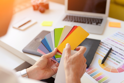
 Some colors have become synonymous with certain big companies: red is part of CocaCola’s brand, IBM is “Big Blue,” and McDonalds is identified by the golden arches. Make colors work for you when you’re redecorating your office, designing a logo, or creating advertising material.
More than 15 years ago I looked into this subject and learned then that color can account for 60% of the acceptance or rejection of a product or service (while this stat is quoted often, my original source/link for it no longer works). So I thought I’d go back and paint a picture of how colors can be useful in your business.
The psychology of color
I’m not an expert in this area, but there’s a great guide on this from QuickSprout. The 20-page guide covers color theory, the meaning of color, and more. Some highlights noted in the guide:
- 6% of people say that the visual impression is the number one factor affecting their purchase decision (over smell, taste, etc.);
- People make a subconscious judgment about a product in 90 seconds after an initial viewing;
- Magazine readers recognize color ads 26% more often than black and whites.
Brief color chart for businesses
Here’s what the experts say about different colors, which may affect your choices for painting your office, choosing a logo, or selecting a product label. You’ll notice that many of the examples don’t follow what the color suggests.
- Red — It shows action, warmth, power, excitement, and heat. It’s good for: Automotive sales, casinos, pet shops, pasta restaurants and pizzerias. Examples: Johnson & Johnson, Travelers Insurance, 3M, Coca-Cola, Airbnb, Tesla.
- Orange — It shows warmth and happiness. It’s good for: Mexican restaurants, fitness centers, vitamin shops, dance clubs, and businesses with products targeting Latin American and French consumers. Examples: Home Depot, Nickelodeon, Gulf.
- Yellow — It shows sun, warmth, cheerfulness, and optimism. It’s good for: florists, candy shops, toy stores, amusement parks, and discount stores. Examples: Ikea, BestBuy, Caterpillar, Cheerios, Denny’s.
- Green — It shows nature, youth, money, and renewal. It’s good for: financial businesses (e.g., accountants, financial planners), green businesses (e.g., vegetable/organic stores, landscapers). Examples: Groupon, Whole Foods, H&R Block.
- Blue — It shows peace, trustworthiness. It’s good for: medical offices, motels, pool companies, weight loss centers. Examples: IBM, American Express, Twitter, Chase, Facebook.
- Purple — It shows luxury and sophistication. It’s good for: artists, bookstores, upscale clothing boutiques, jewelry stores, nightclubs. Examples: Yahoo!, Cadbury, LA Lakers.
- Brown — It shows reliability, comfort, and maturity. It’s good for: coffee shops, lumber yards, craft stores, hardware stores, and western clothing stores. Examples: Hershey’s, M&Ms, UPS.
- Black — It shows power, elegance, technology, and sophistication. It’s good for: accountants, attorneys, music stores, tire stores. Examples: Uber, Walt Disney Company, Mercedes-AMG.
- White — It shows purity, cleanliness, and freshness. It’s good for bakeries, bridal shops, caterers, cleaning services, day care centers, dry cleaners, and wineries. Example: Puma.
Final thought
Of course, Apple, Google, and NBC choose to use a rainbow of colors for their logos. Select what you like and what you think will work best for you.


